
Kurt Vonnegut's Storytelling Shapes in Art, Pt. 1
By Wil Forbis
08/01/2016Recently, I was introduced to the following graphic describing Kurt Vonnegut's concept of story shapes. (Click here for an enlarged version.)
From Visually.
Vonnegut's idea makes a lot of sense. Using his premise, we can create a visualization of any story by tracking the protagonist's fortunes along a Y axis and the reader's progress through the book on the X axis. What Vonnegut theorized was that for all the millions of stories out there, there really are only a limited amount of story shapes.
(Very recently, computer scientists performed a kind of data analysis on 1700 stories and the results seemed to confirm Vonnegut's thesis. The study made the case that there are six basic story shapes.)
An obvious question arises: Can Vonnegut's idea be applied to other arts? To music, or painting or sculpture? I think the answer is yes and I will use this two-part article to make my case.
The Shapes of Stories
First, let's examine these story shapes a bit more. In essence, their peaks and valleys correspond to the emotional state the author is trying to generate in the reader at a particular point in the story. To alter the story shape, the author changes the circumstances (the plot) of the story. If the main character has a healthy baby, it's a high point for both the character and the reader sympathetic to that character. If, several chapters later, that baby mutates into a bat creature that attacks and kills the protagonist's husband, that's a low point. (Unless she really didn't like her husband.)Using this process, one can map out the shape of most stories. Star Wars, for example, would follow Vonnegut's "Man in Hole" shape. Luke starts out living an uneventful life as a moisture farmer. Then his aunt and uncle are killed and he's sucked into a seemingly doomed attempt to destroy the main weapon of the galaxy-spanning Imperial Forces. Things go from bad to worse as he and his friends are trapped in the Death Star garbage disposal and his mentor, Ben Kenobi is killed. (This is the deepest part of the hole in the "Man in Hole" shape.) But Luke eventually learns to trust his latent Jedi instincts and leads a successful attack on the evil space station. At the end, he is rewarded for his efforts and is on the path to becoming a Jedi knight. His fortunes are far higher than when he began, as this particular story shape would dictate they should be.
Several Twilight Zone episodes illustrate Vonnegut's "From Bad to Worse" story shape. Consider "Stopover in a Quiet Town" or "Mirror Image." (Links go to Wikipedia's synopses of the episodes.)
Turning to Music
It's easy to see how an author can affect the shape of his or her story via the plot. But what about music? How can a composer affect an emotional arc? After all, there's no obvious protagonist in music, nor is there a story in any standard sense. (Operas and musicals would be the exception to this.)While composers may not have storytelling techniques at their disposal, they do have other tools that can generate the emotional states, good or bad. In musical language, composers often talk about tension and release. Tense moments in music are "heavy" and seem to push towards a cathartic moment of musical resolution, a release. For example, consider the following instrumental song, one of my own. The first 3 minutes and 40 seconds are relatively sedate but then the flavor turns dark with an oppressive, heavy metal feel. At about 5:50 the tension lifts and the initial happy feeling returns.
Composers have many tools at their disposal to create tension. An obvious one is simply volume. When the music is barely audible the listener struggles to hear and tension arises. When the volume is raised deafening levels, the listener yearns for the joy of silence.
Rhythm can also generate tension. Simple, metric rhythms where percussive hits arrive at predictable points may be exciting but they do not produce any real tension. When rhythms become more complex and the listener's mind struggles to understand the patterns produced, tension arises. It is released with these complex or unpredictable rhythms subside.
For a great example of tense, bizarre rhythms, check out Jerry Goldsmith's classic "Planet of the Apes" score.
Harmony, the sounding of two or more notes of music at the same time, is perhaps the most fruitful technique for generating tension and release. Musicians often describe harmonies as either dissonant (tense) or consonant (resolved). What do they mean?
Consider first that a single note is really a sound wave, a series of vibrations in the air with peaks and valleys. For example, one instance of the note "A" vibrates 440 times a second. Another "A" an octave lower vibrates 220 times per second, an octave lower than that vibrates at 110. As you can see, halving or doubling the frequency rate changes the octave.
When two notes are played at the same time, their peaks and valleys may line up in a predictable fashion producing consonance, or the peaks and vallies may not match thus producing dissonance. See the diagrams below. Add in a third note and the possibilities of sweet and strange mixes of consonance and dissonance increase. Generally speaking, notes closer together (say, A and A#) are more dissonant while notes further apart less so.
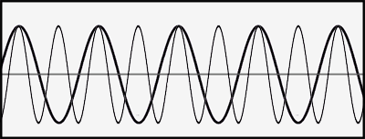
Consonant Wave Forms
In the diagram below half of the peaks of the thin lined wave nicely align with the peaks of the thicker lined wave.
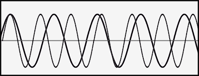
Dissonant Wave Forms
In the diagram below the peaks of the thin lined wave seldom align with the peaks of the thicker lined wave.
Of course, when we listen to music we aren't consciously calculating whether the wave forms of the various notes we are hearing are in or out of synch. We simply observe nature of the sound---"pretty" for consonant harmonies, "ugly" for dissonant ones. The calculation is subconscious.
It's also worth noting that dissonance can have a certain odd appeal because of its lack of beauty. It's the judicious use of dissonance that powers the allure of jazz, blues, modern classical and heavy metal music. And we can see the same thing in storytelling. Certain readers appreciate the ugliness rife in darker forms of fiction like horror. (Of course, that literary tension is almost always released with a cathartic ending.) Too much predictable consonance is boring.
The Visual Arts
Volume, rhythm and harmony are but a few ways that musicians can generate tension and release and thus construct the shape reflecting the emotional state of their music. Let's now consider visual arts such as painting, sculpture, and photography. Can the output of these art forms also be conceived us of having shapes rife with tension and release?First we must consider that there's an inherent difference between stories/music and visual arts. Stories and music unfold over a period of at least minutes whereas visual arts are usually appreciated and observed over a much shorter time frame; indeed, we generally take in the broad concept of a painting or photograph within a space of seconds.
With stories and music, the longer time frame grants creators an ability to balance sections of the work against each other. In a pop song, it's common to balance the low dynamics of a verse against the higher energy of the chorus. In a novel or film the "heavy" scenes of violence or steamy romance are balanced against less dramatic but much longer sections of characterization and unfolding plot.
Visual arts also seek to play with balance. A balanced work of art has a feeling comparable to consonance in music---it feels resolved or settled. An unbalanced work has a feeling of dissonance---it feels tense or unsettled
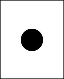
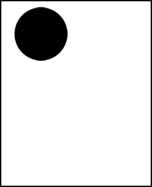
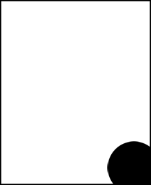
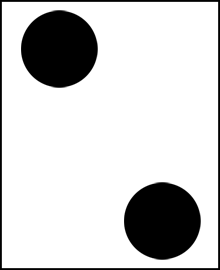
How do visual artists play with balance? Take a look at a few examples:
In the first image, the circle is centered and the picture feels balanced. In the second, the weight has shifted, the area with the black circle feels a bit "heavier." In the third, we feel like the circle is leaving us, creating a bit of tension. ("Where is it going?")
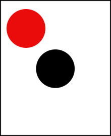
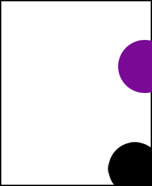
Let's add in a new circle to each picture.
The addition of the red circle in the first picture has thrown the balance off. The new circle demands attention (e.g. it's heavier) both because of its placement and the emotional stridency of the color red. The second picture now feels a bit more centered as the weight of the new circle balances out the old one. And the tension of the third picture is only increased with the inclusion of a new, colored circle coming (or leaving?) from the right.
Color and placement of elements are but a few of the many ways visual artists can change the balance of the picture. For more, I recommend these links.

This gives us an overview of how the balance in a story, music composotions or piece of art can be played with. But what is really meant by balance? I believe the notion of balance ties in with our ability to predict our environment. A balanced environment is one that matches our predictions, an unbalanced environment is one that that violates our predictions. Next month, in part 2, we'll take a look at our brain's power of prediction and the role it plays in appreciating art.
What do you think? Leave your comments on the Guestbook!
Wil Forbis is a well known international playboy who lives a fast paced life attending chic parties, performing feats of derring-do and making love to the world's most beautiful women. Together with his partner, Scrotum-Boy, he is making the world safe for democracy. Email - acidlogic@hotmail.comVisit Wil's web log, The Wil Forbis Blog, and receive complete enlightenment.